
How to create a multilevel dropdown menu in React
This tutorial is a simplified version of this tutorial written by Ibadehin Mojeed.
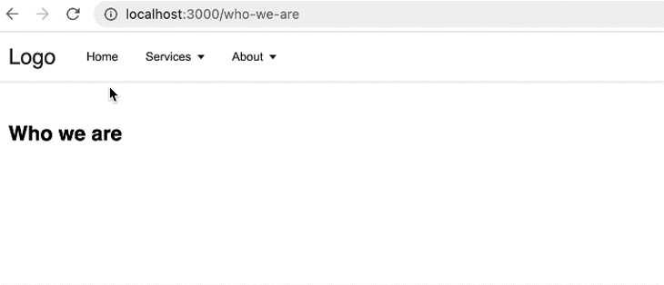
If you want a complete explanation, you have to read his article. He also has another article where he explans how to make dropdown menus with CSS. You could check that out here. At the end we will have something like this:
So let's start with our code. If you want to create a multilevel dropdown menu, one good way is to use recursive functions. As in GeeksForGeeks explained:
A Recursive function can be defined as a routine that calls itself directly or indirectly. In other words, a recursive function is a function that solves a problem by solving smaller instances of the same problem. This technique is commonly used in programming to solve problems that can be broken down into simpler, similar subproblems.
Basically a Recursive function is a function that calls it self, something like this:
myRecursiveFunction(){
   // some code
   myRecursiveFunction()
   // some code
}
Well you may say that it causes an infinite loop. That's right but not if we have a condition that stops the function call in a certain state, something like:
myRecursiveFunction(){
   // some code
   if(true){
    return
   }
   myRecursiveFunction()
   // some code
}
It is also good to know that any problems that you can solve using a recursive function, will always have an alternative looping solution, but most of the time a recursive function makes our life easier. So in our case, imagine that we have an array of menus and submenus like this:
[
  {
    title: "Home",
    url: "/",
  },
  {
    title: "Services",
    url: "/services",
    submenu: [
      {
        title: "web design",
        url: "web-design",
      },
      {
        title: "web development",
        url: "web-dev",
        submenu: [
          {
            title: "Frontend",
            url: "frontend",
          },
          {
            title: "Backend",
            submenu: [
              {
                title: "NodeJS",
                url: "node",
              },
              {
                title: "PHP",
                url: "php",
              },
            ],
          },
        ],
      },
      {
        title: "SEO",
        url: "seo",
      },
    ],
  },
  {
    title: "About",
    url: "/about",
    submenu: [
      {
        title: "Who we are",
        url: "who-we-are",
      },
      {
        title: "Our values",
        url: "our-values",
      },
    ],
  },
];
We can write a function which is responsible for rendering our whole navigation, i called it Header just as Ibadehin Mojeed did, because our header tag which is inside of this function, wraps everything, but you could call it whatever you want. I also wrote a usestate for small screens.
export default function Header() { const [toggle, setToggle] = useState(false); return ( <header className={` ${toggle ? "active" : ""} `}> <div className="nav-area"> <Link href="/" className="logo"> logo </Link> {menuItems.length ? ( <> <nav> <ul className="menus"> {menuItems.map((menu, index) => { const depthLevel = 0; return ( <MenuItems items={menu} key={index} depthLevel={depthLevel} /> ); })} </ul> </nav> <div className="menuToggle" onClick={() => setToggle(toggle === true ? false : true)} ></div> </> ) : null} </div> </header> ); } function MenuItems({ items, depthLevel }) { const [dropdown, setDropdown] = useState(false); function onMouseEnter() { window.innerWidth > 960 && setDropdown(true); } function onMouseLeave() { window.innerWidth > 960 && setDropdown(false); } return ( <li className="menu-items" onMouseEnter={onMouseEnter} onMouseLeave={onMouseLeave} > {items.submenu ? ( <> <button type="button" aria-haspopup="menu" aria-expanded={dropdown ? "true" : "false"} onClick={() => setDropdown((prev) => !prev)} > {items.title}{" "} {depthLevel > 0 ? <span>»</span> : <span className="arrow" />} </button> <Dropdown depthLevel={depthLevel} submenus={items.submenu} dropdown={dropdown} /> </> ) : ( <Link href={items.url}>{items.title}</Link> )} </li> ); } function Dropdown({ depthLevel, submenus, dropdown }) { depthLevel = depthLevel + 1; const dropdownClass = depthLevel > 1 ? "dropdown-submenu" : ""; return ( <ul className={` dropdown ${dropdownClass} ${dropdown ? "show" : ""} `}> {submenus.map((submenu, index) => ( <MenuItems items={submenu} key={index} depthLevel={depthLevel} /> ))} </ul> ); }
As you see, there is a MenuItems function inside of Header function, which is responsible for creating submenus ( lis ) inside of our menus ( uls ), or maybe just single submenus ( lis ). Our MenuItems function is our recursive function, it calls itself indirectly by Dropdown function and that items.submenu ? is its termination condition, if that condition is false, then it just simply creates a Link, but if that is true, then it will create a button( so the user can click or hover to see submenu/s ) and then it calls itself by Dropdown function to again, create either a Link or a button.
Here is the css code to make it feel more like a navigation:
* {
  margin: 0;
  padding: 0;
  box-sizing: border-box;
}

body {
  font-family: sans-serif;
}

header {
  box-shadow: 0 1px 3px 0 rgba(0, 0, 0, 0.07), 0 1px 2px 0 rgba(0, 0, 0, 0.05);
  color: #212529;
}

.nav-area {
  display: flex;
  align-items: center;
  max-width: 1200px;
  margin: 0 auto;
  padding: 10px 20px;
}

.logo {
  text-decoration: none;
  font-size: 25px;
  color: inherit;
  margin-right: 20px;
}

.menus {
  display: flex;
  align-items: center;
  flex-wrap: wrap;
  list-style: none;
}

.menu-items {
  position: relative;
  font-size: 14px;
}

.menu-items a {
  display: block;
  font-size: inherit;
  color: inherit;
  text-decoration: none;
}

.menu-items button {
  display: flex;
  align-items: center;
  color: inherit;
  font-size: inherit;
  border: none;
  background-color: transparent;
  cursor: pointer;
  width: 100%;
}

button span {
  margin-left: 3px;
}

.menu-items > a,
.menu-items button {
  text-align: left;
  padding: 0.7rem 1rem;
}

.menu-items a:hover,
.menu-items button:hover {
  background-color: #f2f2f2;
}

.arrow::after {
  content: "";
  display: inline-block;
  margin-left: 0.28em;
  vertical-align: 0.09em;
  border-top: 0.42em solid;
  border-right: 0.32em solid transparent;
  border-left: 0.32em solid transparent;
}

.dropdown {
  position: absolute;
  left: 0;
  left: auto;
  box-shadow: 0 10px 15px -3px rgba(46, 41, 51, 0.08), 0 4px 6px -2px rgba(71, 63, 79, 0.16);
  font-size: 0.875rem;
  z-index: 9999;
  min-width: 10rem;
  padding: 0.5rem 0;
  list-style: none;
  background-color: #fff;
  border-radius: 0.5rem;
  display: none;
}

.dropdown.show {
  display: block;
}

.dropdown .dropdown-submenu {
  position: absolute;
  left: 100%;
  top: -7px;
}

@media (max-width: 1300px) {
  nav {
    display: none;
    max-height: 50vh;
    overflow-x: hidden;
    overflow-y: auto;
  }

  .menus {
    padding-left: 0px;
  }

  .dropdown .dropdown-submenu {
    position: initial;
  }
  .dropdown {
    position: relative;
    border-radius: 0;
    box-shadow: none;
  }
  header nav {
    position: absolute;
    width: 100%;
    top: 70px;
    left: 0;
    background-color: #e5e2ff;
  }
  header.active nav {
    display: initial;
  }
  header nav ul li {
    width: 100%;
  }
  header nav ul li ul {
    position: relative;
    width: 100%;
    left: 0;
  }
  header ul li ul li ul {
    top: 0;
    left: 0;
  }
  header nav ul li:hover ul li {
    background-color: #ffffff;
  }

  .menuToggle {
    position: relative;
    width: 40px;
    height: 50px;
    cursor: pointer;
    display: flex;
    justify-content: center;
    align-items: center;
    margin-left: auto;
  }

  .menuToggle::before {
    content: "";
    position: absolute;
    width: 100%;
    height: 3px;
    background-color: #000000;
    transform: translateY(-12px);
    box-shadow: 0 12px #000000;
  }

  .menuToggle::after {
    content: "";
    position: absolute;
    width: 100%;
    height: 3px;
    background-color: #000000;
    transform: translateY(12px);
  }
  header.active .menuToggle::before {
    transform: rotate(45deg);
    box-shadow: 0 0 #000000;
  }
  header.active .menuToggle::after {
    transform: rotate(315deg);
  }

  .nav--options-large {
    display: none;
  }

  .nav--options-small {
    display: initial;
  }
}
Conclusion
So that was it for this tutorial. If you still didn't understand what a recursive function does, that's totally fine, because i explained it in short, so go ahead and google it :))